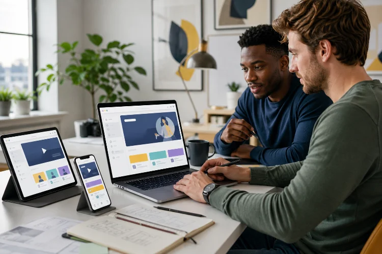
Building an educational website used to be fairly straightforward: publish lessons, add a navigation menu, and give visitors somewhere to find learning materials. Today, expectations are much higher.
Modern learners switch between smartphones, tablets, and laptops. They may study for ten minutes during a commute, return later from another device, watch a video instead of reading an article, or search Google for one very specific answer.
An effective learning platform needs to support all of those behaviors without becoming complicated.
That is why understanding how to build an educational website for modern learners involves more than choosing an attractive template. You need to think about learning goals, content structure, mobile usability, accessibility, performance, engagement, and discoverability.
The good news is that you do not need to create the next massive online university. A focused website with clear content and thoughtful user experience can be far more useful than a feature-heavy platform that overwhelms learners.
Here is how to approach it.
1. Start With the Learner, Not the Technology
One of the easiest mistakes is choosing technology before deciding who the website is actually for.
Before comparing learning management systems, WordPress plugins, video platforms, or custom development options, define your audience. A website teaching basic mathematics to children requires a completely different experience from a professional training portal for software developers.
Ask what learners want to achieve, how experienced they are, what devices they commonly use, and how much time they are likely to spend during each learning session.
You should also define measurable learning outcomes. Instead of saying, “Students will learn photography,” create something more specific, such as, “Students will understand aperture, shutter speed, and ISO well enough to shoot manually.”
This keeps your content focused and prevents technology from becoming the goal instead of supporting the learning process. UNESCO’s guidance on digital learning platforms similarly emphasizes that technology should be guided by educational needs rather than technological novelty.
2. Build a Simple and Predictable Website Structure
Educational websites can quickly become messy. Courses lead to modules, modules lead to lessons, lessons contain resources, and suddenly learners need a map just to find the next page.
Keep the information architecture predictable.
A typical structure might move from the homepage to a subject or course page, then to modules, individual lessons, assessments, and supporting resources. Learners should always understand three things: where they are, what they have completed, and what comes next.
For example, imagine a beginner digital marketing course. Instead of placing 40 lessons in one massive library, you could seperate them into modules such as SEO Fundamentals, Content Marketing, Social Media, Email Marketing, and Analytics.
Breadcrumb navigation, clear lesson titles, progress indicators, and prominent “Next Lesson” buttons can make a large learning library feel much easier to navigate.
Good structure also helps search engines understand your content. Google’s SEO guidance recommends logical organization, descriptive URLs, useful internal links, and content that is designed primarily for people rather than algorithms.
3. Design for Mobile Learners From the Beginning
Mobile design should not be something you check after finishing the desktop version.
Responsive web design allows content to adapt to different screen sizes and resolutions while maintaining usability across devices. For an education platform, this matters because learners may move between devices throughout the day.
Keep navigation compact, use readable font sizes, provide generous spacing around buttons, and avoid layouts that require horizontal scrolling.
Learning content should also work naturally on smaller screens. Long paragraphs can feel exhausting on a smartphone, so break information into short sections with descriptive headings.
Videos should resize properly, quizzes should be easy to complete with touch controls, and downloadable materials should not be the only way to access important information.
Think of mobile users as primary learners, not visitors receiving a reduced version of the “real” website.
4. Make Accessibility Part of the Design
An educational platform should give as many people as possible a meaningful opportunity to learn.
The Web Content Accessibility Guidelines, or WCAG, provide internationally recognized recommendations for improving accessibility for people with disabilities.
In practical terms, this means adding meaningful alternative text to important images, supporting keyboard navigation, maintaining sufficient contrast, labeling forms correctly, providing captions or transcripts for videos, and avoiding interfaces that depend entirely on color.
Semantic HTML is also important because properly structured elements can help browsers and assistive technologies interpret the page correctly.
Accessibility does not have to make a website boring. In many cases, an accesible interface is simply a clearer interface.
You can also apply Universal Design for Learning principles. CAST’s UDL framework encourages learning experiences that provide multiple ways for learners to engage with information, understand it, and demonstrate what they know.
5. Create Content in Small, Focused Learning Units
Modern learners rarely want to dig through twenty pages before discovering the answer they need.
Instead, organize educational content into focused lessons with one primary objective. A lesson might contain a short explanation, visual example, video, practical exercise, and quick knowledge check.
Suppose you are teaching photography. Rather than publishing a huge lesson called “Everything About Camera Settings,” create personlized sections covering shutter speed, aperture, ISO, white balance, and focus modes.
Each lesson can stand independently while still connecting to a larger learning path.
This approach also makes content easier to update. If something changes, you can revise one module instead of rebuilding an entire course.
Different formats can support different learning preferences as well. Text articles work well for detailed explanations, while diagrams can simplify complex systems, videos can demonstrate processes, and quizzes can encourage learners to actively recall information.
6. Add Interaction Without Creating Distractions
Interactive features can improve an online learning enviroment, but more interaction does not automatically mean better education.
Use features because they support a learning objective.
A short quiz after a lesson can help students check their understanding. Progress tracking can encourage them to continue. Practical assignments allow learners to apply concepts instead of simply consuming information.
Discussion areas, comments, live sessions, or community features can also provide valuable social interaction when the subject benefits from collaboration.
However, avoid turning every page into a collection of pop-ups, animations, badges, notifications, and competing buttons.
Learners should spend most of their attention on learning.
A simple five-minute lesson followed by one meaningful activity can sometimes be more effective than a visually impressive page containing ten interactive widgets.
7. Prioritize Website Speed and Performance
A beautiful learning platform becomes frustrating when every lesson takes several seconds to load.
Large videos, uncompressed images, unnecessary scripts, complicated page builders, and excessive third-party plugins can gradually slow a website down.
Google’s Core Web Vitals focus on important aspects of real-world user experience, including loading performance, responsiveness, and visual stability.
Compress images, use modern image formats when appropriate, enable browser caching, optimize fonts, minimize unnecessary JavaScript, and consider a content delivery network if your learners are geographically distributed.
Video files are usually better delivered through a dedicated streaming solution rather than uploaded directly to ordinary shared hosting.
Performance becomes particularly important when serving learners using inexpensive devices or unreliable internet connections. UNESCO’s digital learning charter specifically highlights support for low-cost devices and intermittent connectivity as part of inclusive platform design.
8. Build SEO Into the Educational Content
Search engines can become one of your strongest learner acquisition channels.
Start with topics people genuinely search for. A programming website, for example, might publish lessons around questions such as “how CSS Grid works” or “Python list vs tuple” instead of producing vague articles with clever but unsearchable titles.
Use one clear H1, descriptive H2 and H3 headings, concise URLs, useful internal links, descriptive title tags, and relevant meta descriptions.
However, avoid forcing keywords into every paragraph.
Google explicitly recommends creating helpful, reliable, people-first content. SEO can support that content, but optimization should not replace usefulness.
Educational websites have a natural SEO advantage when they answer specific questions thoroughly. Over time, individual lessons can attract search traffic while guiding visitors toward complete courses, newsletters, memberships, or related learning resources.
Building an educational website for modern learners is ultimately about removing barriers between curiosity and understanding.
Start with clear learning goals, organize information logically, design for mobile devices, make accessibility a priority, and divide complex subjects into manageable lessons.
Add interaction where it strengthens learning, keep the platform fast, and use SEO to help the right audience discover your resources.
You do not need hundreds of courses or expensive technology to begin. Start with one useful learning path, observe how visitors use it, gather feedback, and improve the experience over time.
If you are planning an education platform, begin by outlining your first learner journey today. A simple, focused website that genuinely helps people learn is a much stronger foundation than a complicated platform filled with unused features.