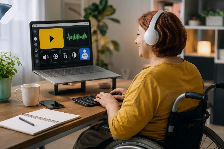
Imagine signing up for an online course only to discover that you cannot navigate the lessons with a keyboard, understand an important diagram, or follow a video because it has no captions.
The educational content may be excellent, but the experience still fails if learners cannot comfortably access it.
That is where accessible web design becomes essential.
Accessibility means designing websites and digital learning environments so people with different abilities, devices, and ways of interacting with technology can use them effectively.
This is not a small audience, either. The World Health Organization estimates that around 1.3 billion people, roughly 16% of the global population, experience significant disability.
Understanding how accessible web design supports every online learner is therefore about more than meeting technical standards. It is about removing unnecessary barriers to education.
When lessons are easier to navigate, read, hear, understand, and interact with, the benefits often extend far beyond learners with disabilities.
1. What Does Accessible Web Design Actually Mean?
Accessible web design means creating digital content that people can perceive, operate, understand, and use with different technologies.
The Web Content Accessibility Guidelines, better known as WCAG, provide internationally recognized recommendations covering accessibility for people with visual, auditory, physical, speech, cognitive, language, learning, and neurological disabilities.
In an educational setting, accessibility can affect almost everything.
A student may need captions to understand a recorded lecture, keyboard controls to complete a quiz, alternative text to interpret an educational image, or properly structured headings to move through a long lesson with a screen reader.
Accessible design does not mean creating a completely seperate version of a course.
Ideally, accessibility is built into the main learning experience from the beginning.
2. Clear Structure Makes Lessons Easier to Understand
Online education often involves large amounts of information. Without a clear structure, even simple material can become frustrating.
Semantic HTML can help browsers and assistive technologies understand what each part of a page represents. MDN recommends using the correct HTML element for its intended purpose because native HTML includes useful accessibility features by default.
For example, lesson titles should use real headings rather than ordinary text that has simply been made large and bold.
A logical page might follow this structure:
Course Title → Module → Lesson → Topic → Exercise
Learners using screen readers can then move between sections more efficiently. The same structure also helps sighted learners scan a page and quickly understand where information belongs.
Short paragraphs, descriptive headings, and logical content order can make complex educational material feel much less intimidating.
Good accesibility often looks remarkably similar to good content design.
3. Keyboard Accessibility Opens More Learning Paths
Not everyone navigates a website with a mouse or touchscreen.
Some people rely primarily on keyboards because of mobility limitations, assistive technology, temporary injuries, personal preferences, or even hardware problems.
MDN explains that an accessible web page should allow users to access and control its functionality using only a keyboard.
Try opening an online course and pressing the Tab key.
Can you reach the navigation menu? Can you start the video? Can you select an answer in the quiz? Can you submit an assignment?
Just as importantly, can you clearly see which element currently has keyboard focus?
A visible focus indicator helps users understand where they are on the page. Removing it simply because a designer thinks the outline looks unattractive can make navigation significantly harder.
Test the Complete Learning Journey
Do not test only the homepage.
Keyboard testing should include logging in, opening a course, moving between lessons, completing forms, taking assessments, controlling media, and reaching the next activity.
Accessibility needs to work across the entire learner journey.
4. Captions and Transcripts Make Video Learning More Flexible
Video has become a major part of online education, but audio should not be the only way to understand a lesson.
WCAG requires captions for prerecorded audio content in synchronized media under applicable accessibility criteria.
Captions are especially important for deaf and hard-of-hearing learners, but their usefulness goes much further.
A student might be studying on public transportation without headphones. Another may be learning in a noisy house. Someone studying a second language may understand technical vocabulary more easily when they can read and hear the words together.
Transcripts can also help learners search for specific information without replaying an entire video.
For example, someone reviewing a 30-minute biology lecture could search the transcript for “mitochondria” and immediately find the relevant explanation.
Accessibility features often solve problems for people you were not originally designing them for.
5. Images Need Meaning, Not Just Decoration
Educational websites frequently rely on diagrams, photographs, illustrations, charts, maps, and infographics.
For someone who cannot see an important image clearly, the information it contains may disappear unless another method is provided.
W3C recommends using text alternatives according to the purpose of an image. Informative images need meaningful descriptions, while decorative images can often use an empty alternative-text attribute so assistive technologies can ignore them.
Consider an online geography lesson containing a map showing the movement of tectonic plates.
Alt text such as “tectonic plate map” tells the learner very little.
A more useful description might explain that the map shows several major plates and indicates movement toward or away from neighboring boundaries.
The goal is not to describe every pixel. It is to communicate the information that matters to the lesson.
6. Color and Readability Affect More Learners Than You Think
A modern educational website may look impressive with pale gray text, subtle buttons, and colorful dashboards.
But beautiful design becomes less useful when important information is difficult to see.
W3C’s accessibility review guidance specifically includes checking headings, text resizing, and color contrast when evaluating a page.
Avoid communicating important information through color alone.
For example, suppose quiz answers are marked green for correct and red for incorrect. Adding icons or text such as Correct and Try Again gives learners another way to understand the result.
Typography matters too.
Readable font sizes, comfortable line spacing, short paragraphs, and sufficient whitespace make long lessons easier to follow. These choices can benefit learners with low vision, dyslexia, attention difficulties, small screens, or simply tired eyes.
The best reading enviroment is usually one that asks as little effort as possible from the reader.
7. Accessible Forms Make Quizzes and Assignments Easier
Forms appear everywhere in digital education.
Students use them to register, answer quizzes, submit assignments, search course libraries, contact instructors, and provide feedback.
A poorly labeled form can become surprisingly difficult to complete.
W3C recommends associating clear labels with form controls so users can understand the purpose of each input.
Instead of relying only on placeholder text such as “Type here,” provide a permanent label such as Your Answer or Email Address.
Error messages should also explain what went wrong.
“Invalid input” is not particularly helpful.
“Password must contain at least eight characters” gives the learner something specific to fix.
These small details make interfaces feel calmer and more predictable for everyone.
8. Accessibility Supports Different Ways of Learning
Accessible education is not only about physical interaction with a website. Learners also differ in how they engage with and understand information.
The Universal Design for Learning framework from CAST encourages providing multiple means of engagement, representation, and action and expression.
In practical terms, an online lesson might explain the same concept through text, an illustration, a captioned video, and a practical activity.
That does not mean every single lesson needs five different formats.
Instead, designers and educators can think about where one format creates unnecessary barriers.
A complicated process might be easier to understand with a diagram. A demonstration may work better as video. A long recorded lecture can become easier to review with a transcript.
Providing options allows more learners to find a path that works for them without creating a completely different course for every individual.
9. Accessibility Should Be Tested, Not Assumed
A website can look accessible and still contain serious problems.
That is why testing matters.
W3C’s Easy Checks recommends reviewing areas such as page titles, alternative text, headings, contrast, keyboard access, focus visibility, forms, multimedia alternatives, and basic page structure.
Automated testing tools can identify many common problems, but they cannot judge everything.
A tool might confirm that an image has alt text, for example, but it cannot always determine whether that description actually communicates the educational meaning.
Human testing remains valuable.
Try navigating using only a keyboard. Zoom the page. Turn captions on. Test forms. Use a screen reader when possible. Ask learners with different accessibility needs for feedback.
Treat accessibility as a consistant part of design and content maintenance rather than something checked once before launch.
Accessible web design helps create online learning environments where fewer people are excluded by the interface itself.
Clear structure, keyboard navigation, captions, useful image descriptions, readable typography, accessible forms, and multiple ways of presenting information can make digital education easier to use for a much broader audience.
More importantly, many accessibility improvements benefit everyone. Captions help learners in noisy places, keyboard navigation improves efficiency, strong contrast improves readability, and clear headings make long lessons easier to scan.
If you manage an educational website, start by testing one complete course from a learner’s perspective.
Identify the barriers, fix the most important ones, and make accessibility part of every future design decision. Inclusive learning begins when access is treated as a core feature rather than an optional extra.